



Components Typography

Petal Pro is the full SaaS app this is built for

Auth, billing, admin, and Claude Code integration included. One purchase, unlimited projects.

Typography

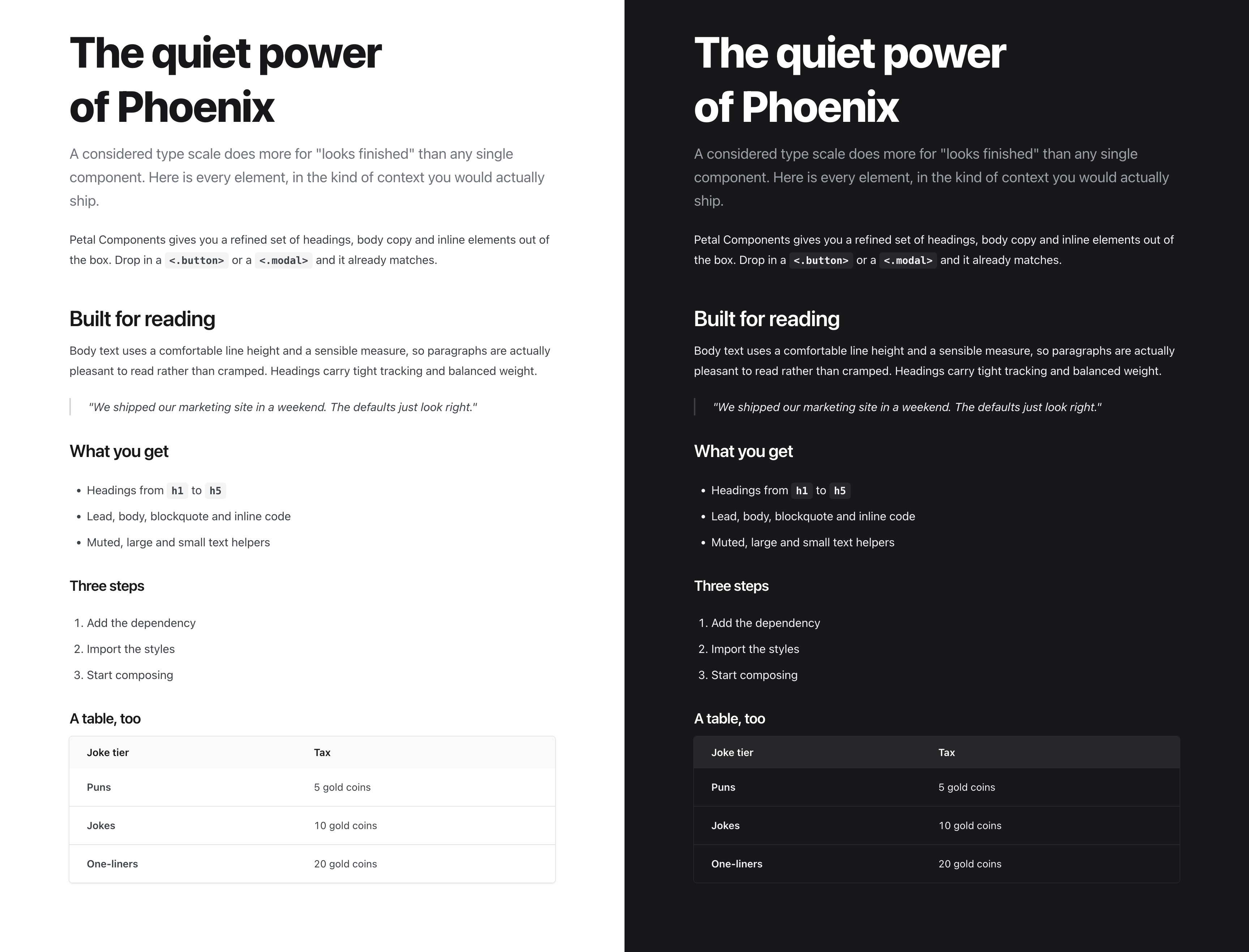
Typography is the cheapest way to make an app look finished, and the easiest thing to get subtly wrong. Petal Components ships the whole type scale with that work already done: headings, body, lead, blockquote, inline code, lists, text helpers and a divider, all on consistent emphasis tiers with vertical rhythm built in. Drop them into a page and it reads the way a designed page should, in light and dark, with no manual spacing. To render raw HTML such as converted markdown, use Prose.
The Petal Components type scale rendered side by side in light and dark mode
One page, the same components, in light and dark. Everything below is rendered live.

In context

Every element composing together with no manual spacing. Drop the components in and the vertical rhythm just works, in light and dark.

The quiet power of Phoenix

A considered type scale does more for "looks finished" than any single component. Here is every element, in the kind of context you would actually ship.

Petal Components ships a refined set of headings, body copy and inline elements. Run mix deps.get, import the styles, and it already matches.

Built for reading

Body text uses a comfortable line height and a sensible measure, so paragraphs are pleasant to read rather than cramped. Headings carry tight tracking and a balanced weight.

"We shipped our marketing site in a weekend. The defaults just look right."

What you get

  • Headings from h1 through h5
  • Lead, body, blockquote and inline code
  • Muted, large and small text helpers

The joke tax

Even a table reads cleanly, with the data set brighter than its header so figures scan at a glance.

Joke tier Tax
Puns 5 gold coins
Jokes 10 gold coins
One-liners 20 gold coins

Headings

Heading 1

The Lighthouse at the Edge of the Map

heex
<.h1>The Lighthouse at the Edge of the Map</.h1>
Heading 2

Where the ferries stopped running

heex
<.h2>Where the ferries stopped running</.h2>
Heading 3

A keeper and her lamp

heex
<.h3>A keeper and her lamp</.h3>
Heading 4

The night the fog rolled in

heex
<.h4>The night the fog rolled in</.h4>
Heading 5
Notes from the harbour master
heex
<.h5>Notes from the harbour master</.h5>
Custom colour

The blue hour

heex
<.h2 class="text-sky-500 dark:text-sky-400">The blue hour</.h2>
Gradient

A light that never dims

heex
<.h1>
  <span class="text-transparent bg-clip-text bg-gradient-to-r from-indigo-500 via-purple-500 to-pink-500">
    A light that never dims
  </span>
</.h1>
Heading properties
elixir
            # <.h1>, <.h2>, <.h3>, <.h4>, <.h5>
  attr(:class, :string, default: "", doc: "CSS class")
  attr(:label, :string, default: nil, doc: "label your heading")
  attr(:no_margin, :boolean, default: nil, doc: "removes margin from headings")
  attr(:underline, :boolean, default: false, doc: "underlines a heading")
  attr(:color_class, :string, default: nil, doc: "adds a color class")
  attr(:rest, :global)
  slot(:inner_block, required: false)


Paragraphs

Here is a paragraph

heex
<.p>Here is a paragraph</.p>
Paragraph properties
elixir
            # <.p>
  attr(:class, :string, default: "", doc: "CSS class")
  attr(:no_margin, :boolean, default: nil, doc: "removes the bottom margin")
  attr(:rest, :global)
  slot(:inner_block, required: false)


Lead

A larger, muted introductory paragraph for the top of a page or section.

Petal Components is a set of HEEx components for Phoenix, built to look finished out of the box.

heex
<.lead>Petal Components is a set of HEEx components for Phoenix.</.lead>

Blockquote

"The defaults just look right, so we shipped the marketing site in a weekend."
heex
<.blockquote>"The defaults just look right."</.blockquote>

Inline code

For code snippets within a sentence.

Install the dependency with mix deps.get and you are ready to go.

heex
<.p>Install with <.inline_code>mix deps.get</.inline_code> to begin.</.p>

Text helpers

Emphasis and secondary copy: text_large, text_muted and text_small.
Large: an emphasised line of body text.

Muted: captions, hints and metadata.

Small: tight label text.
heex
<.text_large>Emphasised body text.</.text_large>
<.text_muted>Captions, hints and metadata.</.text_muted>
<.text_small>Tight label text.</.text_small>

Lists

  • List item 1
  • List item 2
  • List item 3
  1. List item 1
  2. List item 2
  3. List item 3
heex
<.ul>
  <li>List item 1</li>
  <li>List item 2</li>
  <li>List item 3</li>
</.ul>

<.ol class="mt-5">
  <li>List item 1</li>
  <li>List item 2</li>
  <li>List item 3</li>
</.ol>
List properties
elixir
            # <.ul, <.ol>
  attr(:class, :string, default: "", doc: "CSS class")
  attr(:rest, :global)
  slot(:inner_block, required: false)


Divider

A horizontal rule with sensible vertical spacing.

Above the divider.


Below the divider.

heex
<.hr />

Prose

Title

Here is a paragraph

Here is a another paragraph

  • List item 1
  • List item 2
heex
<.prose>
  <h1>Title</h1>
  <p>Here is a paragraph</p>
  <p>Here is a another paragraph</p>
  <ul>
    <li>List item 1</li>
    <li>List item 2</li>
  </ul>
</.prose>
Prose properties
elixir
            # <.prose>
  attr(:class, :string, default: "", doc: "CSS class")
  attr(:rest, :global)
  slot(:inner_block, required: false)